What Color Picture Frame Should You Get?
The frame answers to the wall, not to the picture. Get that order right and the decision takes thirty seconds.
By Janet H. · Published

Default to black on a pale wall and wood or white on a dark wall. The frame needs contrast against the wall behind it, and that is the only thing the decision really turns on. Match the artwork second, and only when the wall question is already settled.
People get this backwards: they pick a frame to match the colors in the picture, hang it, and find the frame has vanished into the wall or jumped off it. The frame is a border between two things. It only works if it reads as separate from both.
Disclosure: Hang & Hue earns commission from qualifying purchases made through the links on this page, at no extra cost to you. As an Amazon Associate we earn from qualifying purchases. It does not change which products we recommend or the order they appear in — read our editorial policy and full affiliate disclosure.
Quick picks
Tap any row to jump to the full write-up.
| # | Product | Best for | Price |
|---|---|---|---|
| 1 | 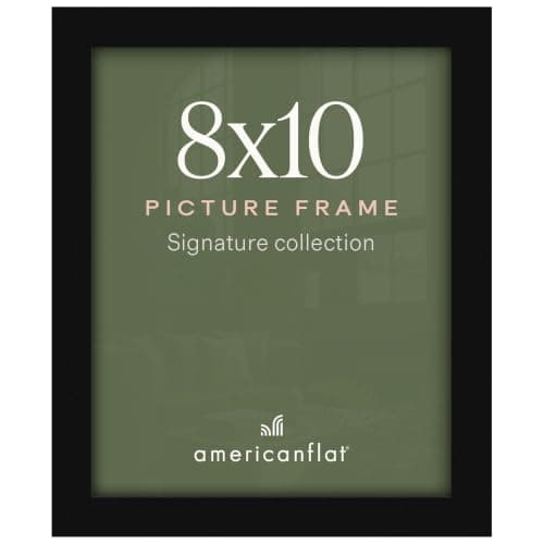 Americanflat Picture Frame The default answer on any pale wall, in every size from 4x6 to 24x36, with plexiglass light enough to hang on strips and a removable mat on most sizes. | Best black | $9.99 · View on Amazon #ad How we’re funded · Price as of November 1, 2026 |
| 2 |  Frametory Picture Frame Wood-tone frames with real glass on many lines, for the warm-wall and traditional-artwork cases where a flat black edge would fight the image. | Best wood tone | $35.49 · View on Amazon #ad How we’re funded · Price as of November 1, 2026 |
| 3 | 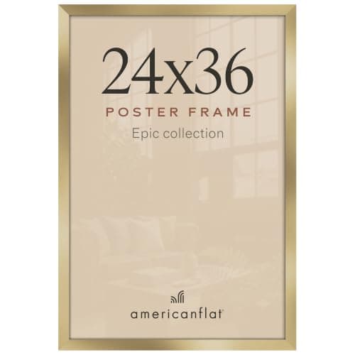 Americanflat Gold Poster Frame Gold on an engineered wood molding at poster sizes, which is the one finish that genuinely sings on a dark wall where black would read as a hole. | Best gold | $49.99 · View on Amazon #ad How we’re funded · Price as of November 1, 2026 |
| 4 |  Golden State Art Pre-Cut Mat Board A wide acid-free mat provides the contrast the wall will not, which is why a mat solves the frame-color problem on mid gray, sage and patterned walls. | Best fix for a mid-tone wall | $17.99 · View on Amazon #ad How we’re funded · Price as of November 1, 2026 |
The rule: contrast with the wall first
A frame does one job. It separates the artwork from the wall so your eye knows where the picture ends. If the frame is the same value as the wall — the same lightness or darkness — that separation does not happen and the piece looks unfinished no matter how good the art is.
Squint at the wall and ask one question: is it light or dark?
- Light wall (white, cream, pale gray, pastel): a dark frame works. Black is the default.
- Dark wall (charcoal, navy, forest, deep terracotta): a light frame works. White, pale wood or a warm metal.
- Mid-tone wall (mid gray, sage, olive, taupe): both ends work, and this is where a wide white mat earns its keep by providing the contrast itself.
Frame color against wall color
| Wall | First choice | Also works | Avoid |
|---|---|---|---|
| White / off-white | Black - maximum contrast, disappears as an object | Mid or dark wood; black-stained wood | White, which vanishes; pale gold, which looks tentative |
| Cream / warm neutral | Mid-brown or teak wood | Black; warm gold on a traditional piece | Cool silver, which reads cold against warm walls |
| Pale gray | Black, or light oak for something softer | Silver; white-washed wood | Warm teak, which reads orange against cool gray |
| Mid gray / sage / olive | Black with a wide white mat | White; light wood | Mid-brown wood, which is the same value as the wall |
| Charcoal / navy / dark green | White, or pale wood | Gold - the one wall where it genuinely sings | Black, which reads as a hole in the wall |
| Bold color (teal, mustard, pink) | Black, as the neutral referee | White, with a wide mat | Any wood tone, which adds a third color to the argument |
| Wallpaper or pattern | Black with a wide white mat - the mat is doing the work | White frame, white mat | Anything narrow and unmatted, which gets lost in the pattern |
Per-finish roundups, once you have picked: black, wood and gold.
When the artwork does get a say
The wall decides first, but there are four cases where the artwork overrides it.
- Black and white photography. Black frame, white mat. This is not a preference, it is close to a convention, and departing from it almost always looks worse.
- Traditional oils, watercolors and botanicals. A warm wood or gold molding. A flat black frame reads as a hard, modern edge against soft paint.
- Bright, graphic, high-color work. Black or white. Anything with a color of its own becomes a competing voice.
- A single dominant color in the image. Pick the frame up from the image’s darkest neutral, never from its brightest hue. A frame matched to the bright blue in a print dates fast and limits where the piece can hang.
Mixing frame colors on one wall
A gallery wall can mix frame colors, but only on one condition: something else has to repeat. Mixed frames with mixed mats and mixed artwork is not eclectic, it is noise.
Pick one element to hold constant:
- Same mat, different frames. The strongest option. A white mat in every frame becomes the repeated element and the frames read as texture.
- Same frame, different art. The safest option, and the one that needs no judgment.
- Two finishes only. Black and wood is the pairing that works almost everywhere. Three or more finishes needs real confidence.
Do gallery wall frames have to match covers this in full, and the matted frame roundup covers using mats as the unifier.
Finish matters as much as color
Two frames can both be “black” and look nothing alike, because sheen is a separate variable from color and the listing photograph will not show it.
| Finish | Reads as | Best for |
|---|---|---|
| Matte | The frame edge dissolves; the art dominates | Photography, monochrome, the default |
| Satin | A faint sheen; slightly more present | Mixed walls, where a block of matte looks heavy |
| Gloss | Definitely a frame; reflective | Traditional interiors, ornate profiles |
| Brushed metal | Directional sheen that changes with the angle | Silver and gold; modern rooms |
| Distressed / limed | Texture rather than color | Adding interest to a flat pale wall |
This is the reason frames from two different lines never quite match even in the same nominal color. If you are buying several, buy them from one line in one order.
Two finishes sit outside this chart because they are materials rather than colors. Metal frames carry an anodized or powder-coated surface that holds its color between production runs better than paint does, and ornate vintage frames vary so widely in gold tone that matching two of them is a buying decision rather than a color one.
The picks in full
Each entry states what it is for, the specification that decides it, and who should skip it.
1. Best black
Americanflat Picture Frame
Americanflat
The default answer on any pale wall, in every size from 4x6 to 24x36, with plexiglass light enough to hang on strips and a removable mat on most sizes.
- Sizes
- Wide standard range from 4x6 to 24x36
- Glazing
- Shatter-resistant polished plexiglass on most sizes
- Matting
- Most sizes ship with a removable mat
- Orientation
- Hangs vertical or horizontal; most sizes also stand
The spec that decides it: 4x6 to 24x36 with polished plexiglass and a removable mat on most sizes.
Skip it if: Your wall is charcoal or navy, because black disappears into it.
#ad How we’re funded · Price as of November 1, 2026
2. Best wood tone
Frametory Picture Frame
Frametory
Wood-tone frames with real glass on many lines, for the warm-wall and traditional-artwork cases where a flat black edge would fight the image.
- Sizes
- Standard sizes with matted and unmatted options
- Glazing
- Real glass on many lines
- Matting
- Ivory or white mats on matted lines
- Orientation
- Wall or tabletop
The spec that decides it: Real glass glazing with matted and unmatted wood-tone options.
Skip it if: The wall is cool gray, because a warm mid-brown reads orange against it.
#ad How we’re funded · Price as of November 1, 2026
3. Best gold
Americanflat Gold Poster Frame
Americanflat
Gold on an engineered wood molding at poster sizes, which is the one finish that genuinely sings on a dark wall where black would read as a hole.
- Sizes
- Poster sizes including 24x36
- Finish
- Gold on an engineered wood molding
- Glazing
- Shatter-resistant plexiglass on the large sizes
- Orientation
- Vertical or horizontal
The spec that decides it: Gold engineered wood molding with plexiglass on the large sizes.
Skip it if: Nothing else in the room is a warm metal, because gold needs something to echo.
#ad How we’re funded · Price as of November 1, 2026
4. Best fix for a mid-tone wall
Golden State Art Pre-Cut Mat Board
Golden State Art
A wide acid-free mat provides the contrast the wall will not, which is why a mat solves the frame-color problem on mid gray, sage and patterned walls.
- Cut
- Pre-cut bevel opening, standard step-down sizes
- Material
- Acid-free board with backing and a clear sleeve on most packs
- Sizes
- Common pairs such as 11x14 matted to 8x10
- Packs
- Singles and multi-packs
The spec that decides it: Pre-cut beveled openings on acid-free board, with backing.
Skip it if: Your opening is non-standard, because pre-cut mats come in stock pairs only.
#ad How we’re funded · Price as of November 1, 2026
Common questions
What color picture frame should I get?
Decide against the wall, not the artwork. On a light wall, black. On a dark wall, white or pale wood. On a mid-tone wall, either, with a wide white mat providing the contrast. Only then consider the picture, and only in the four cases where the artwork overrides the wall.
What color picture frames go on white walls?
Black, which gives maximum contrast and reads as a shadow line rather than an object. Mid or dark wood also works and is warmer. Avoid white frames, which vanish into the wall, and pale gold, which looks tentative against bright white.
What color picture frames go on gray walls?
Black on pale gray, and black with a wide white mat on mid gray. Light oak, limed wood and silver also sit well because they share the wall's cool tone. Avoid warm teak and mid-brown wood, which read orange against gray.
Can you mix frame colors on a gallery wall?
Yes, as long as something else repeats. The strongest version is the same white mat in every frame, which becomes the repeated element and turns the frames into texture. Two finishes - black and wood - works almost everywhere; three or more needs real confidence.
Should the frame match the artwork or the wall?
The wall, first. A frame separates the art from the wall, and it can only do that if it contrasts with the wall. Matching the frame to a color inside the picture usually produces a frame that either disappears into the wall or jumps off it.
Sources for the figures on this page
Read next
- Best Black Picture Frames
Black frames compared on profile width, glazing weight and stocked sizes, plus the finish difference that decides how a black frame reads up close.
- Best Wood Picture Frames
Solid wood, engineered wood and wood-finish frames separated, with the picks that state what they are made of and the sizes each line stocks.
- Best Gold Picture Frames
Gold frames compared on which gold they actually are, flat versus ornate profiles and how to buy them in multiples.
- Matching vs Mixed Frames
The four variables on a gallery wall, how many you can change at once, and why mixed walls usually fail.
- Best Matted Frames
Matted frames compared on border width, acid-free board and the step-down sizes each line covers.
- Wood vs Metal Frames
Profile width, weight, humidity stability and durability compared — plus which material each room wants.
- Neutral Palette Wall Art
Why matching the sofa fails, what neutral actually means, and how to keep a quiet palette from going flat.
- Best Picture Frames
Frame lines compared on glazing, mat quality, size range and depth — plus what genuinely changes with price.